Website Jo Castillo Art


Back to my website:

Showing posts sorted by relevance for query color. Sort by date Show all posts

Friday, January 25, 2008

A Happy Medium - Color and Value

There have been a couple of different discussions going on in my on-line learning process. In thinking about these discussions in relation to how I work, I think I found the perfect painting to illustrate both subjects ... maybe??

In Michael Chesley Johnson's post he started out by discussing painting in pastels with a very limited palette. To do this effectively you need to have knowledge of value and color theory. Michael makes good use of complements and color variation to show depth without a large value change. By color variation, I mean warm and cool tones in the same color. A warm red has orange tones and a cool red has blue tones. The warm colors come toward the viewer and the cool colors recede, giving form to flat shapes. In using only 12 or so pastels, Michael has a small value range to give shape to form (in his painting, it is the landscape). As Michael says in his thread and discussion on wetcanvas.com "But quite often, beginners, in order to distinguish light from shadow, will push the value contrast too much and make the lit areas far too light. A more satisfactory approach is to not push the value contrast, but to push the color temperature contrast instead." (Value is how light or dark a color is. If the value is correct, it is said, you can paint an object any color and it is still the object.) It is a good idea to go read both the blog and comments and the wetcanvas.com thread, you will find it interesting and a learning experience. The discussion is with Micahel and several other pastel artists that teach as well. Questions from emerging artists are thrown into the mix for a lively read.

Maggie Stiefvater has been discussing complements and was nice enough to point to my painting, "Pears on Red". This ties in with Michael's discussion in the temperature of colors. Complements are opposite on the color wheel, red and green for example. These colors seem to vibrate when placed next to each other creating excitement in a painting. Too much can create tension. By blending the two, you gray down the color and you can push it either way. More red, you get gray red and more green you get a gray green. You can make more sense of that if you keep reading.

My tendency in painting has been to use color to describe everything. I hadn't studied much about value and in the past few years I have made progress. After taking workshops and reading the artist blogs and all the learning venues on-line I have begun to add more value/contrast into my work. The idea is too fool the eye into thinking that the flat painting surface has depth, almost like 3-D. I am hoping you can see the difference and that my paintings have more "pop" with the combination of value and color.

A good example is my pastel painting, "Pears on Red".


In this first photo the painting looks pretty good. The colors give the pears shape. You can definitely tell where the red tablecloth ends and the green paper begins. There is a difference in the yellow and more green pear. The color tones give them shape, the yellow green comes forward on the front of the pears and the more blue green goes back. The grayed shadows recede as well. The complements of red and green add the excitement, dominated by red so that there is not an equal amount of green to fight with the red for attention.


When changed to black and white, value comes into play. You can hardly tell where the green paper meets the red table cloth and of course you cannot tell the color of the pears, they are close in value. The shapes are somewhat lost and look flat.


After studying the black and white photo, I pumped up the value contrast. You can see the difference the pears have a better shape. I didn't add any new colors, just darkened the shadows and cloth and put stronger highlights on the fruit and plate. The highlights on the green pear is actually light red, not white. On the plate the highlights are light green. This is using complements for vibrancy and value, too.


Checking it out again in black and white you can see where the values added to the shapes.


Pears on Red
Pastel on Art Spectrum Colourfix Paper
11 x 14 inches

In framing, the green paper doesn't show of course. I hope you like it.

I find that I usually use a limited palette. I take the pastels from their containers and keep them in a tray so I use the same sticks without hunting for them. In my class with Bob Rohm in October I learned that before I start my painting, I take out a dark, medium and light pastel stick in colors I think will work. For example for the trees, 3 greens. As I work I will probably add a cooler or warmer green. In the end, I guess I will usually have around 20 - 30 pastels out. With pastels you can under paint shadows with black to get a darker blue or purple. You can blend in or scumble a little, very little, white to lighten a color. (This takes practice.) When I paint with oils or acrylics I rarely have more than 12 colors out. I rarely use black in liquid paint. I rarely use white or black alone in any medium.

My conclusion in this is that artists must find a happy medium where color and value improve paintings. An artist can also work with a limited palette using color temperature to enhance the shapes and value to add more drama.

Wednesday, September 14, 2011

Hey, It's Art Time - Color Theory

We have been so tied to the fires in Bastrop that I haven't done much art.  I did sketch at the B & B on my birthday but my camera isn't working well so will post that later.

Regina sent me this link about color.  Very interesting, the color does not look blue in different situations.  

This is one of the hardest parts of learning about color.  When I am teaching or doing a demonstration, people will ask what color I am using. I say that it is not important, the important thing is to use the color that looks right there.  Richard Mckinley talks a bit about it here.  He is one of the best at contrast and simultaneous color for me.  The colors around your color change it in value, hue, etc.  A medium color looks dark on white paper and light on dark paper so where you put the color is very important.

Have fun thinking about color.

Tuesday, February 02, 2010

Sketches Hunt 164 and Color Notes

For a start on Scavenger Hunt 164, I did these two while watching TV, Are You Smarter Than a Fifth Grader?. Sometimes yes, sometimes no, by the way. These sketches are in the regular sketchbook with a Micron 005 pen, purple. A few minutes each, freehand as usual.

Number 1, phone -- the phone from my desk out of the dock. Number 2, watch -- an old pocket watch with a leather strap on it, probably my Dad's.

And color notes. I was watching an old video tape by Helen Van Wyk today and she was mentioning how color is affected by the color it is next to on the canvas. Many times, as beginners, we ask the instructor what color they are using and try to match it exactly. Even if you could match it, it would most likely not look exact on your canvas because of the difference in the paint's surroundings. The colors take on or reflect the complement. You can test this by putting a red circle on a white background and stare at it.

Then close your eyes and you should "see" a greenish circle.

Helen Van Wyk usually started paintings with a gray canvas and on the video tape, she was painting some terracotta pots. As she developed the pots and had not touched the background it was appearing very blue. I will try to do this exercise and post it here. It was quite interesting.

Black and white acrylics.

The pots with color, there is a subtle blue to the background now, which you probably can't see here. I had hopes that it would show more.

The more finished pots.

I thought it would show up more. Maybe I had to do a larger painting. This was only about 6 x 8 inches and about ten minutes to do. I did it on watercolor paper so it dried before I could finish each layer. But maybe you get the idea.

This illustrates the idea that the color depends on the background. The orange and blue stripes are one solid line of the color on a black to white background. The colors look brighter against the dark and darker as the black changes to white.

You never know if the color is right until you try it on your painting.

Wednesday, May 07, 2008

Elements of a Good Painting, Pastel Demo

The demonstration last night at the Bastrop Fine Arts Guild went well. I demonstrated by doing a pastel painting and talking about the Elements of a Good Painting. I created a handout with ideas I have gleaned from experience and other artists. (see end of post)

Each artist has their own method and style, but we can always watch and learn and use the ideas that fit into our interpretation and style. My information and education comes from workshops, reading, watching and practice. I think practice helps the most at this stage. I learn from every painting and sketch I do.

A few of the artists I have attended workshops with: Jack Hines, Jessica Zemsky, Terry Smith, Kathleen Cook, Bob Rohm, and Richard McKinley. Artist friends are very influential and helpful (check out my links to the right). You can learn a lot from painting with others.

We need to practice and work at our art. We also need to break into self publicity and for most of us that is the hardest part. I have links on my blog in the sidebar to the right, Helpful Links for Artists. From there you can jump off into a whole new world of learning and discovery.


Of course, I was too nervous to think about photos at the demo. (My camera was in my pocket) There were several photographers there and I forgot to hand off my camera to one of them. We took photos at the end. I didn't take a photo of the painting until it was already under glass, but this is a pretty good image after stretching and fixing with my photo software. It is 8 x 10 inches on Colourfix sanded paper. I precut the paper to 11 x 14 to fit the frame. Upon finishing I put the painting in the frame with a double mat, stapled it closed, taped it with artist's tape to seal it and ta-da. The painting!

My plan was to give the painting as the door prize, so I asked the attendees to fill in a card as they arrived.

Greatchen Dueble was the happy winner.

A shot of Greatchen and me together.

Here is the information from the handout:

ELEMENTS AND IDEAS FOR GOOD PAINTINGS

  • Be happy. Be in a good mood and enthusiastic. Be physically comfortable. Have your surface at a good angle with no leaning over. If you aren't comfortable you won't be able to enjoy and do it again and often enough to improve. If you do more small or fast paintings, you learn more that one large painting that takes weeks to finish. (This was suggested by Susan Carlin, executor of good paintings.)
  • If you paint/draw on paper, mark off the standard size area before you start to conserve cost of framing. Take photos of your efforts and try to frame them. (Susan and I both do this and have for a long time.)
  • Lighting on the surface and your palette should be the same.
  • Get focused. Remember why you wanted to paint the subject and what you liked about it. Simplify your information.
  • Thumbnails on paper help most artists. Sketch main items and values in a value sketch. Three to five main values and shapes. Squint to see values and large shapes. For still life and portraits you can take photos and manipulate them on a computer to help decide on colors, background, etc.
  • Composition is important. You can have a triangle shape, circular, rule of thirds, off center, etc. Most landscapes have the rule of thirds. If the sky is important, make it two thirds of the painting or vice versa if the land is important. There are very few times that centering the focal point feels correct. Paintings are more interesting if the center of interest is not in the middle.
  • Balance. Too much info in one place gives an "off kilter" feeling.
  • Contrast and value changes create excitement and interest. Usually the most contrast is in the center of interest. Most good paintings have a dominant value .. dark, light or medium with the other two as accents. A midday scene is harder to make interesting with the lighting being direct and the same over all. Morning or evening scenes with shadows are more dramatic.
  • Try to tie in your shadow areas and your light or mid ground areas. This helps in the flow of the painting and directing the eye.
  • Vary your shapes, size and margin lines.
  • Color and value change depending on the objects next to it. A color on your palette may look perfect, but on the canvas be too dark or light. You can actually hold the brush or pastel up against the object in the distance to help judge your starting colors. It is helpful to put down color around the canvas to coordinate your painting. I usually try to have some of each color in every part. Not necessarily the same value, but the same color. Complements (opposite colors on a color wheel) are usually found in shadows and highlights.
  • To create depth, vary placement and overlap objects. "Kissing" or touching of objects is a no-no.
  • In landscapes, aerial perspective is important. Cool colors and light values go back into the distance, warm colors and darks come forward. There are exceptions but it takes practice. Van Gogh used a yellow background for his blue iris and it worked. :)
  • In still life usually the back is darker and the light is up front and on top of the items. On the background it is darker where the light is coming from and lighter around the subject except for the shadows.
  • For realism in objects I try to use five values. The body (main) color, the body shadow, the cast shadow, the highlight and the reflection. For example in a brass object, it is mainly yellow - body color. The shadow as the object turns away would be a darker yellow with some purple to gray it - body shadow. The shadow on the table would have purple and be the darkest value - cast shadow. The darker side would have some light from the table or other objects, this light would not be as light as the highlight and would have some of the complement and color from the object - reflection. The highlight on brass would be very light, almost white, and a touch of lavender/purple would make it look brighter - highlight. (Advice from Helen Van Wyk and others.)

Now ... THE BEST ADVICE ... forget about rules and methods and advice and GO PAINT!!

I wish I could always follow my own advice. :) You will see here if I put the painting into black and white that my values are very similar and I have almost zero highlights. It was one of my efforts where I used color to separate instead of value, right? Something I work on. I have an excuse, I was trying to do the painting in forty minutes.

Friday, January 15, 2016

Sketching Plein Air and Inside

Yesterday, I sketched in the big/huge sketchbook with a Micron 03.  I sketched at the dining table looking out the bay window.

Scavenger Hunt 435 http://www.wetcanvas.com/forums/showthread.php?t=1396150  
Number 10, 11 and 12, sketch with horizon line, two trees or more and something man made - the view out the window
 
This morning's digital sketch was started on my iMac.  I like trying to draw with just the mouse.  Not easy.  I use Sketchbook Pro on my computer.  It is a good program.  However I could not find the "color picker" which is used to match a color you used earlier and want to go back to.  You can use that color to add something or erase/straighten a line with the background color.  It was very frustrating trying to do the multi colored design.  I messed with it for about an hour and then abandoned the iMac and went to the iPad.  If I had thought, I could have used the palette they have as default and saved all the fuss.

I thought, "Why not keep on with the same program?"  Practice helps, right?  I got into the third color and then realized there was no color picker on my iPad either.  Rats!  I carried on with just filling in a new color when I changed and then air brushing over the lines.  I must have spent another 40 minutes or so on the end of the rug I had started.  Pbfttt.... I finally gave up.  Next complicated thing will be done with the app,  Brushes, which I am used to!  I did learn something, didn't I?  When I went to put the number on the sketch, I saw the real problem ... Number 13.


Number 13, texture, pattern - end of the rug (needed to do the middle design over)

Today was supposed to be about 60 degrees.  After we had lunch, I stepped out on the porch and in the protected area it was 77 degrees!  I decided to do a plein air sketch on the porch.  I got out my easel and the box of pastels that goes on the easel.  I spent about 40 minutes on this sketch.  More successful. 
I'll use this for Number 14, unique - view unique to my porch.  This is much farther away, I used my zoom.  :)

By the way, this paper is the paper I used for the bowls day before yesterday.  I just wiped it off.  I usually don't do that as Mi Tientes paper is very inexpensive.  By wiping it off, though, I had an under painting of blue.  The bowls and dark lines covered well.  I meant to take a photo, but once I decided to paint/sketch I just forgot anything else.  This is a good way to practice without worrying about the paper or making a masterpiece.

I enjoyed my afternoon.  Gene was riding his trike.  Good for both of us.

Monday, March 10, 2014

Blue Practice Pastels

Guess that title can be taken many ways.  In my last class with Enid Wood enidwood.com we were working on pastel paintings using the color BLUE.

Blue can be a bit tricky as there are sooooo many variations in color and temperature.  For shadows and to push something back in your painting, you usually use a cool blue.  Warm blues for sunny skies.  It really depends on the color around it and each painting.

The complement is orange.  Orange mixed into blue dulls the blue toward gray.  Put blue and orange beside eachother and the colors vibrate.


Here are a few blues that you can compare. Which look cool?  The feel will change depending on what they are next to.  On the white they look darker, on the black they look lighter and on the orange very intense.


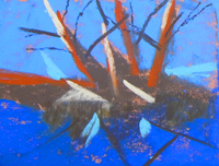
This is my blue practice painting.  I did it on a rust/orange Colourfix sanded paper (9 x 12) and you can see the color peeking through to add texture and interest to the blue.

I put "color" in my search box on the left and pulled up these posts about color, value and painting.  A good review!
http://jocastilloartblog.blogspot.com/search?q=color

You can put Instruction or other key words and find more posts in the "how to" genre.

Tomorrow will be our GREEN lesson.  I'll show you my practice after class.  It is so good for me to get together with other artists.  You should try it sometime.


Sunday, December 16, 2007

Sixty Minute Artist: "Relative" Value and Color and Demo

I have been wondering where I got the link to look at Jerry Lebo's blog. I can't remember or find it. He works full time and tries to get in sixty minutes a day on his art work. He is a wonderful painter and writes instruction articles very well. This one about value and color is great for me. I always need help with that part of painting.

Sixty Minute Artist: "Relative" Value and Color

At the workshop with Bob Rohm at the end of October, he stressed value changes also. One of his tips for pastel painters was to pick out about 3 values of each color that you are thinking of using in the painting so you remember to use them. This would be a light, medium and dark green for example. Susan Carlin was talking about Helen Van Wyk in one of her comments and Helen uses 5 main values in a painting.

The body color, which is the main color of the item.
The body shadow, where the form turns.
The cast shadow, where something actually casts a shadow.
The reflected light.
The highlight.


To clarify this here is a snippet of one of my tomato paintings.

Original Painting


Helen Van Wyk's five values


My painting corrected with darker body shadow and darker shadow.

In my original painting, I showed the form of the tomato mostly with color. You can see that the painting would be more dramatic with the stronger value changes. If you can't see the difference in the first and last, squint a little. From across the room it would make a big difference. Maybe I am learning something over the years. :)


Maybe you can see the difference better in black and white.


Sunday, January 15, 2017

Out and About Again - Pastel Abstract

Another outing with pastel artists yesterday.  Enid Wood www.enidwood.com gave a class for branching out in color with abstracts.  It was good to be with six other artists.  The time flies and we had a good time.  I met two new to me artists.

The day started off weird.  I went to pack my bag which already had my plein air easel top and pastels.  Nice.  I put in some small pastel paper in pads and looked for my ATC, art trading cards.  I could not find them.  I stuck in a pastel board, 5 x 7 that I had been playing with the Pan Pastels on.  The idea was to work in miniature sizes.

Where was my water spray bottle??  No where to be found,  I had seen it recently so I know it is here someplace.  I put in Jennie's spray bottle she left here for a substitute.

The tripod part of the easel was next.  Where was it?  It weighs about 6 pounds I would imagine and is about 16 inches long and 4 inches in diameter when folded.  It doesn't just fit in a drawer or behind a piece of paper.  Not anywhere in the corners or closet in my studio.  In the closet with the spare jackets and old French easel?  No.  Hall closet?  No.  Our closet in the bedroom? No.  Garage with the folding chairs and things from our trip?  No.  Shoot, I must have left it in Silver City but Mitzy would have called.  Maybe the hotel in Big Bend?  I hadn't used it so weird to have left it someplace on the way home.

Finally took the easel part out of the bag and put in a couple boxes of pastels and was off to paint in Smithville ... without an easel.  I could have taken my old watercolor easel, but I was not happy by then and it was getting late ....

The first part of the class was to abstract the shadows of our subject.  Enid brought some clementines and put them on an orange napkin.  My favorite color, right?  Not even!   I worked on the Pastelbord and put a tape across to make it into two miniatures.  They look weird together.


You can see the space down the center where I had the tape.

Abstract shadows in dark and light, any colors.

Using 3 main values.  Added the very dark for shape and to sit the clementines on the cloth.  Sprayed a bit of water for texture when all was done.

I divided a piece of pastel mat into fourths. and did them in order so as to not get my hand on a finished one.  The other board I turned upside down to do each half.


The first two are just colors I like together, again trying for value changes more than color.  I had no reference, just strokes and color.  The third, blue and brown is trees by our lake.  Again, varying strokes and values.  I put the smaller version of the lake so you see more how it really looks.  What looks pinkish here was really a more beige of the paper.  This was my favorite, probably because it is from something real.  ???

The fourth was going to be an abstract of Enid's bag on the floor.  It was purple but I didn't have 4 values in the right colors so made it blue with the 4 values.  It came out more realistic so I'm using it for Scavenger Hunt 481.  http://www.wetcanvas.com/forums/showthread.php?p=21005559
Number 2, on the floor

I won't become an abstract artist anytime soon, but just playing with color is not all bad, especially because pastel is fast and I like color!

Oh, and I found my tripod part of the easel this morning.  I put it in a bag that an old folding table for camping had been in, reusing the bag.  Why didn't I think of that yesterday even when I went and looked with the chairs?  It was with the folding chairs in the garage. Yay!!

Tuesday, September 05, 2017

Adding Color Sketch

I revisited the sketch from the previous post and added color. I like color,  Watercolor and ink can fill a sketch with color.

For fun, I uploaded the sketch to Pigment and colored it on my iPad.  Today, I sat out at the front of the house and added real watercolor to the sketch.

Something different to try and it got my hands int color.

The black and white sketch, posted in previous blog post.

The digitalized color, I missed the upper right corner.  ??

And, the actual sketch colored with Watercolor.


Tuesday, December 09, 2008

Studying Values and a Hint...

Phylis Baker, pastelist, commented on wetcanvas.com (I didn't write down which thread, sorry) a while back with a great idea. She takes a photo of pastels she picks out or uses for a painting and checks in black and white for the values. I often take a photograph of a painting and change it to black and white as the painting is in progress. This would help before you even get started.

I attended a workshop with Bob Rohm last year and he suggested that you pick out a color for each value before you start your painting. He didn't always end up using that color, but it was a starting point.

I put these two suggestions together when I painted the little Arches Park challenge painting the other day, but didn't have time to write about it.

Here are the photos of the pastels I chose to start with:


I don't think the mid range "brown" was too good, I didn't have a color I really liked so I scumbled the darker and lighter together. I tend to use color as a value and that doesn't always work.

As I worked on the painting, I realized I didn't pick out any greens. I also added a couple of colors to get my mid value range in the top row. Here is the full palette:


And the results in color and black and white:


This is a helpful exercise. The painting ended up with a nice amount of light, medium and dark. I will try to do this again on the next painting I start. There isn't as much variety in the greens, but they are a small portion of the painting.

Remember the color version is not true to life as I still haven't had any sun to take a better photo. The shadows on the right were much too dark in real life so I changed them. Maybe I will have sun tomorrow. It is supposed to be very cold, for here. About 50 degrees F. It got up to 80 today about 2:00 p.m. and is down to 61 degrees at 5:20 p.m. It may freeze tonight, they say. Brrrrrrr. I know, you folks up north think we are crazy to think this is cold. It is all relative I guess.

Thursday, October 11, 2018

Hunting is Difficult

The Scavenger Hunts are getting harder for me.  Mainly because I feel I have sketched everything in our house at least once.  Some more often.  I guess for variety I am going to have to use different media.  The problem with that is that I can't put it in the big book and it looks like the big book isn't half full yet, it is taking forever.  Choices, choices.

For Scavenger Hunt 560
http://www.wetcanvas.com/forums/showthread.php?t=1455175

Number 5, bulletin board type - I used the rain gutter shelves above my computer.  I have lots of stuff there, paintings, cards, toys, photos, notes, a $2 bill ??, etc.  My bulletin board of sorts.

Number 6, hanging on the wall - stuff

Speaking of choices, I was looking over Jennifer Rose's blog this morning. https://plus.google.com/103875235243683912364   I usually just comment on her sketches and 3-D drawings/sculptures.  She has a post on Wednesdays called, Wordless Wednesday.  A recent post had some orange flowers in one photo and some fushia flowers in the other.  I was immediately drawn to the pink/redder photo.  Why is that?  What causes our preferences in color?

The only time I recall sort of studying that was years ago there was a fad going about what colors you should wear depending on what "season" you fall into.  I'm a winter.  Winter people wear pure red leaning toward purple. Other colors were navy, white, black.  Fits with me.   Fall folks wear orange and brown.  I was happy not to be a fall person.  Ha.  This blog explains that faze.  Evidently it is still going on:  https://www.colormepretty.co/categories-2/4-season-color-analysis/

How do you feel about your color season?  What is your favorite color?  Red is usually my pick.  I used to go with blue, but not all colors of blue.  I feel drab when I wear powder blue.  I like turquoise and teal.  Navy.  Most purples.

My most un-favorite colors are brown, orange and yellow.  I don't mind wearing a dark chocolate brown  but anything lighter is taboo, especially beige!  Brown for the Hunts has to be wood, very little brown items otherwise in our house.   When we have yellow on the Hunt list there are so few yellow things around here.  Yellow is usually a cleaning cloth or tool with a yellow handle or case.  Orange is hard except for the fruit and the burnt orange of the Texas Longhorns.  I wear orange for the baseball games but that is it!

I'm pretty sure these colors show in my paintings as well.  I rarely get excited about painting a fall scene.  When I do, things lean toward the reds of fall.  I color on my phone and iPad with an app called Pigment.  I was looking at the ones I have colored and there are few with brown.  They suggest a palette  and when it is brown, I lean to the mauve/reddish colors.  It is a fun app by the way.  Good to while away the time and not think.  I click and fill.  You know how impatient I am to actually color, like with colored pencil.  The app has that option, not my favorite part, but you already know that.

No conclusions, just more questions......


Monday, September 28, 2009

Color Notes for Still Life Paintings

When I was commenting about the apples in the previous post, I realized I hadn't mentioned some of the ways I use color in a still life. I talk often about landscapes and the tricks/techniques used to push back the background and create depth. I haven't talked much about still life.

Some ideas I use that I have picked up from various teachers and sources that work in either still life or landscape:

  • Overlapping creates depth
  • Use complements in the shadows AND highlights. The complement grays down and darkens the original color. When used in a highlight, with white, it sparkles as your eye can't focus on the complementary colors side by side. For example in the red apples, the highlights are white with a touch of green, they look brighter than plain white and not chalky.
  • For the dark color, I add a deeper hue and then add a bit of complement. That way you don't get mud. For red on the apples I add alizaron crimson to the cadmium red and then a bit of dark green.
  • The light comes out of the dark so if the light is coming from the right as in the case of the apples, the right side of my background is darker and the left side is lighter. This adds to the contrast as your highlights are against the darker background and the shadows are against the lighter background. Also, the flat surface/table is lighter/brighter. Light reflects on the flat surfaces of steps, rocks, boxes, etc. In the apple painting the background in the photo was all white, one color. I made it a light green gray a little darker on the right and then some yellow ochre in the white of the table in front of the apples.
  • There is a "rule" that if your light is warm, shadows are cool and vice versa. This gives life to a painting. Of course like all rules, you have to go by the results you want to portray.
  • In general I try to have all four corners of a painting different values. In the photo, the three corners were white.
I try for five values, especially in still life paintings. Items look more realistic and they have a better form and shape.
  1. body color, in apples that is red
  2. body shadow, the side away from the light
  3. cast shadow, the shadow under the object, darker than the body shadow. If there is a cast shadow on the object, like if the nose on a face casts a shadow, it is darker than the body shadow of the cheek as it turns.
  4. reflection, the reflected light on the dark side, never as bright as the highlight.
  5. highlight, the reflected light on the light side, it can be soft on cloth or bright like glass.
I hope this give you an idea of how I create form and light in a still life painting. Any comments you wish to make or questions??

Friday, January 19, 2018

Continuous Line and Color Sketches

Back to the drawing board ...
For Scavenger Hunt 527
http://www.wetcanvas.com/forums/showthread.php?t=1440833

My iPhone and the app Brushes was the tool for the continuous line challenge - draw without lifting your pen/pencil and not looking at the paper.  I was wondering how that would work in a digital drawing.  It was fine except when I slowed down too much the app changed color to the background of white in this case.  That is a tool on the app, to hold your finger on the color and it changes to that color.  Used to match a color you used earlier.  I had to start over about 3 times and keep the finger moving. 

Number 4, eyeglasses or sunglasses


My mind is really being scattered this morning.  I looked at the Scavenger Hunt list in my studio and decided that I would sketch a plate, cup, bowl, fruit and fabric in a still life.  It took me a while to find a cup that I haven't sketched in a while.  I chose a burned cup and bowl.  Picked up a small sandwich plate and the bananas on the counter.  I arranged with the corner of a placemat for the fabric. 

I sketched with a Micron 005 in the big book and added colored pencil.  Color sometimes hides some of the faults with the drawing.  Sure it does, right?  The items are numbered wrong.  After taking the photo and coming to the computer to mark of the items on the list, I found that "cup" was not on the list??  What?  No it is not there.  Bowl and plate are plate/bowl so one or the other.  And I didn't do too well with the photo.  Sigh.... 

Number 5, cup and bowl - subbing for pot (which is on the list)
Number 6, plate
Number 7, fruit
Number 8, fabric

There is a good article on FASO today by Keith Bond about why we need art in the world.

http://faso.com/fineartviews/128747/a-world-without-art

Have fun but come back to see me, I will try to regroup and come back, too.


Monday, September 03, 2007

Tree Study Finale, Pastel Painting, Shade Tree

This pastel study of the big shade tree is bringing my tree studies to completion. It will not be the end of painting trees, of course..

Shade Tree is soft pastel on Amersand Pastelbord, 8 x 10 inches from a photo taken in New Mexico last summer.

I worked on studying trees for the month of August. Maggie Stiefvater instigated the idea. At the time, I was working on cottonwoods and was not happy with the result, I decided to just follow through and investigate trees for the month.

The experience taught me a few things and reminded me of some I already knew.

  • Each type of trees have their own structure, just like people or other subjects. A good skeleton will give you a good tree.
  • Paint or sketch what you see, don't make Christmas trees or cotton balls. Suggest leaves in masses, don't do each leaf.
  • Vary the greens, noticing if the green runs to the yellow or blue side. I like to have the compliment, red, in my trees.
  • Take note of the time of day and weather.
  • You can shape the tree with your sky or background color with "sky holes". The color in the holes is slightly darker than the sky or land.
  • Like other landscape composition, you have to overlap and vary the height. I think this is important, even if in real life the trees make a fairly straight line.

Coincidentally on Friday, I received the Pastel Journal for October containing an article, "5 Takes on Trees". The first, Karen Watson has a very realistic style with strong color. Very appealing to my eye. She says she doesn't get caught up in details and changes the scene to better her composition.

Then Jack Pardue who agrees on accuracy in drawing but uses color to keep it interesting and full of life. Nice trees, I guess that is why they chose him, right?

Sarah Bee, focuses on light and minimizes detail. Exciting color with little true green.

Britani Faulkes says, My pastel paintings are often described as anthropomorphic." She paints the shapes more than details.

Brett Varney simplifies trees and uses unusual color and imagination in his oil pastel paintings.

In the end, each artist interprets trees in their own style and palette. I paint in a realistic way, so I need to keep closer to the actual colors and shapes. Practice and experience will help my paintings to convey my ideas and inspiration to the support and on to the viewer.

My tree study posts.

Friday, August 02, 2013

Pastel Painting WIP - Water Underground


I promised a WIP (work in progress) about my new pastel painting.  I painted a windmill in New Mexico using a couple of reference photos and my prospective on the situation.  I planned a scene with the windmill and the present dry conditions of the land.  I love the high desert and like the color combination in the finished painting.

Under Painting
I started on a piece of gray pastelbord.  No particular reason to use the gray, it was what I had on hand.  I lightly sketched the  large shapes and filled them in very lightly with hard pastel.  I put blue on the sky as I didn’t care to have the darker gray showing through.  I used local color to keep a serene tone to the painting.  I often under paint with the complementary (opposite color on the color wheel) to have a vibration of color showing through, not this time though.

Sky Work
I then worked on the sky.  To show depth in a landscape the top of the sky is darker and it gets lighter at the horizon.  The upper, closer clouds are cooler so I used a white that leans toward blue rather than yellow or pink.  The far clouds are warmer so I used a more yellow white a a slight lavender for the shadows.


Developing mid ground
In a landscape I work back to front which also means top to bottom.  I developed the far mountains in blue to push them back.  The next row of mesas were a pinky lavender.  The bluffs are closer, so they get a bit larger and more distinct.  The next hills are a pale, slightly green yellow.  The next layer where the windmill will rest is a bit pinker and the foreground is more red orange and warmer to bring it forward.

Placing windmill tank
I put some cedar trees on the top of the bluffs and the mid ground and began to bring some larger growth as the scene comes forward.  I started the tank that accompanies the windmill.

Nearing completion, time for photo check
I was beginning to get close to completion and took a photo again.  This always shows errors in composition and color. 

Photo lightened on computer
As I worked on the photo to get the photo close to the colors in the painting, I realized it was very much darker than my original idea.  I lightened it on the computer and found it much improved.

Overs
The “cure” for this would be to get lighter in value over the whole panting.  Too bad I couldn't change it by hitting a button on the computer.  The easiest way for me would be to wipe it all off.  I brushed it with a brush and wiped it down with soft Viva paper towels.  I don’t mind doing this, I now had a new under painting to work on and start over.  Anytime you paint with purpose it is good practice.  I do think if I did it again, I would put it on white board with a watercolor underpainting so it would be lighter to start with.

Midway, second time.
I went through the same process, starting with the sky and clouds and working forward.


I was very near completion now and sent a photo to my friendly critique group -- daughters and Regina.  

Critique
Regina found I had changed the perspective on the windmill which was going to be easy to fix.  Thanks, Regina.  (Check out her new Carolina Sky painting ... awesome.)

I added some foreground information, rocks, bushes, etc. and there you have it.  

Water Underground
Pastel on Pastelbord
14 x 11 inches, framed in old barn wood frame


Water Underground, framed
Gene framed it up for me.  He tapes the glass directly to the Pastelbord and seals the back.  Such a good way to frame pastels. 

The painting  is hanging and for sale at Art Connections Gallery, 908 Main St., Bastrop, Texas, 78602.    512 581-1799   http://artconnectionsgallerybastrop.com/  Don't forget the First Friday Artwalk every first Friday!  See previous post for info.


About Me

My photo
Bastrop, Texas, United States
I Grew up in a small town , Magdalena, New Mexico. I enjoy art and the pleasure other people get from my work. I always donate some of my sales and art to charities, especially for children. That started in Bolivia with Para los Niños. "I cannot pretend to feel impartial about colors. I rejoice with the brilliant ones and am genuinely sorry for the poor browns." -- Winston Churchill

Labels

#inktober (49) #inktober2019 (27) #inktober2023 (20) #inktober2024 (2) #inktober21 (11) abstract (1) acrylic ink (1) Acrylic Paintings (75) Arizona (3) Art House Project (14) artist (88) artist blogger (363) artist blogger  instruction (3) artist blogger  instruction (20) artist blogger  instruction (17) artist blogger instruction (42) artist friend (7) at (1) Balloons (1) bas (1) Baseball (231) Bastrop Sketchers (12) Bastrop TX (37) Bolivia (5) Calendar (1) Canada (3) Challenge (6) Charity Events (75) chile (4) classes (3) coaster sketch (9) coffee (1) colored pencil (64) computer art (5) crayon sketches (3) DailyPaintworks Auction (3) demo video (4) Digital Painting (14) doodle (1) dphotos (1) exhibit (157) Figure (4) Fine Art Friends (3) Floweb browsing (1) Flowers (34) food (10) Footwork (1) fused glass (3) Gallery (3) gluten free (5) Golden Open paints (2) Golf (12) House Concert (1) iMac Sketch (1) Inktense (2) inktober2024 (2) inst (1) instruction (78) iPad Sketch (94) iPad sketches (123) iph (1) iPhone painting (3) iPhone sketch (31) jo (1) Jo-oodle (1) Jo's Notion (9) Jo's Thoughts (312) Joanna (2) Joodles (2) Landscapes (137) Marines (30) marker sketches (4) marketing (3) meme (6) memorial (1) Music (70) New Mexico (130) Nonsense (2) Oil Painting (72) Oil Pastel (1) painting buddies (1) PanPastel works (3) Pastel (29) Pastel Demo (60) Pastel Paintings (416) pastel sketch (156) Pastels (12) pears (3) Peru (1) Photo (83) photography (2) Photos (1050) Plein air painting (57) plein air sketch (2) podcast (1) poll (1) pottery (2) Powwow (3) Recipe (6) restaurants (6) scenery (17) Sculptor (7) sculpture (4) seascape (2) sketch (5) Sketche (3) Sketches (2018) snow (2) Still Life (36) Stu (1) Studio (26) Texas (70) Trees (36) tribute (5) under painting (1) Unsorted (7) videos (4) watercolor (180) watercolors (85) web browsing (262) web page (11) wetcanvas (1) WIP work in progress (15) workshop (8) World Blog Hop (2) Yesterfest (2) zentangle (3)