When I sketch, I pretty much paint as I see it. Maybe leave out something in outdoor views or paint just the still life items without a background when indoors.

My sketch had no design (fault of the actual scene and my lack of direction in what I do) and to improve it without starting over I decided to add a bigger tree (size) and some birds to give it some depth. It was foggy so there was no big value change in lighting, but I did make the forward tree darker, larger and overlap which in landscapes brings items closer and also to intensify the colors.

It is still not too exciting. To me watercolor is very flat. I'm learning. You need a very light touch to have the paint work so you don't leave strokes in the washes, like the sky. I'm pretty sure watercolor will never be my favorite medium. I am just too impatient to let and watch the paint dry. But I hope to be able to use it better for plein air when traveling so I don't have to take huge amounts of equipment.
In art class we talked about how Elements of Design are important in a painting and to think about before you even start. One element should dominate to give the painting a good start. Elements are Line, Value, Color, Texture, Shape, Size and Direction.
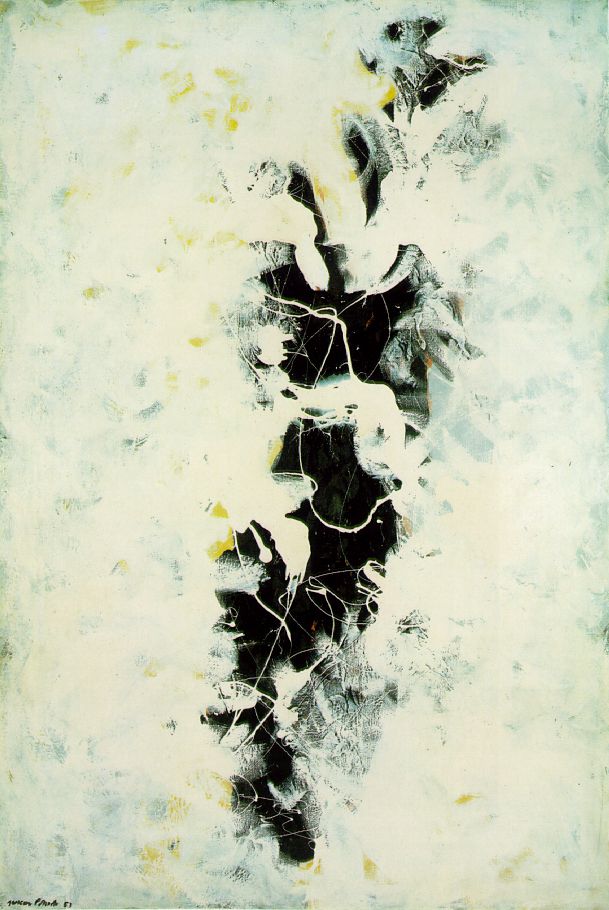
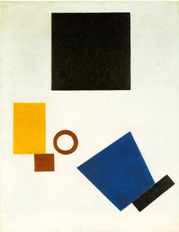
What do you think is the main design component in these three famous abstracts? Think about it before you read on.

Piet Mondrian
Kasimir Malevich
These aren't the paintings that Pomona showed us but the exercise makes you think, right?
My thoughts are that the Pollock is texture over value, the Mondrian is color over lines as the shapes are basically the same. And the Malevich would be shape over color. What do you think?
And these:

Constable

Van Gogh

Vermeer
Is Constable value or texture? Van Gogh value, texture or color? And Vermeer? We were always told his are about the light, so value?
These paintings have most of the elements of design, right? If you change them to black and white you see more value and how important it is. Hmmmm. More and more to think about, eh?


8 comments:
Value seems to be a most important part of design for me. Space seems to be important in your examples (well, maybe not the Mondrian so much).
Your little watercolors are coming along very nicely. You have good depth in them!
Bag Blog, thanks. We are going to work on space and shapes the next class I think. About putting down more feeling than copying a scene. Maybe that will help my creativity.
negative space for the first 3? values for the latter 3?
nicely painted trees :) have you tried gouache?
Good to see you working on the watercolors! Like any medium it takes practice. You are right that watercolors are great for traveling...very portable and you don't need a lot of materials. I've had a busy few days and haven't been back to the hunts...even missed the end of the one I hosted.
Jennifer Rose, Thanks. Interesting how we see the paintings, eh? Different feelings for each of us. I guess if a painting has good design and mixture of the elements it will affect all of us ... just maybe not the same way. :-)
I haven't tried gouache. I went to a workshop where the artist, Jessica Zemsky, painted portraits of children in gouache. They were amazing. That was back in 94. I just looked her up and she is 93 now. How time flies.
Joan, thanks for stopping by. You do amazing watercolors and inspire me to try harder! Don't know how you do all you do.
Jo, your watercolors are very nice; I was especially intrigued by the self-portrait from your previous post. Watercolor strikes me as a very difficult medium; I still like being able to paint over all my oopses in acrylic (in fact, it's essential :>). Your questions about predominating elements really made me look hard and think hard, too. I agreed with you on Pollack and Malevich--was torn between line and color on Mondrian, but went with line. Your choice of color makes sense, as well.
Mary, thanks very much. The elements of painting are sure interesting. I think we will be working with shapes this next session. Maybe all this thinking will make me decide to paint and quit thinking about it. Ha. Hope so.
Post a Comment