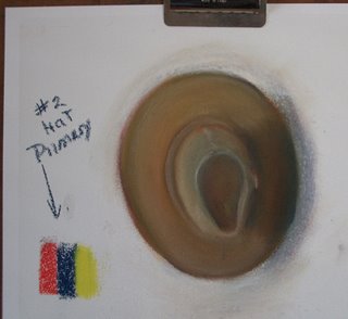
Here is my primary color challenge of the hat (Sketch #2) and a photo of the reference. I did this in soft pastels on Art Spectrum pastel card. I used red, blue and yellow. The blue looks very dark in the photo of the sketch. It was a bright blue, not dark navy. I used a little white to brighten the color. A challenge to get the browns and creamy color. I spent about an hour all together, forgot it was just a sketch and just kept going. Heh, heh. The hat is rounder in real life than my sketch.
I guess my sketch is what I expected to see. These hunts are helping me to get over that and to 'see' better. It is similar to the roses and rocks for me. That is probably one of the reasons that paintings that leave areas to the imagination are appreciated. The viewer can fill in the blanks to suit their own feelings and imaginations. I love to look at very realistic paintings, as well, but they don't touch the emotions as much for me.
I usually lean toward using primary colors in painting. Especially in oils and acrylics. I have never purchased things like turquoise, peach, etc. I have always liked to mix my own colors. My palette is usually: titanium white, cadmium yellow, yellow ochre, cadmium red, indian red (this doesn't go as pink when white is added and mixed with black makes a great background color when you want it to look black, but have color. Especially in still life paintings.), alizarin crimson, burnt sienna, burnt umber, a blue (depending on still life or landscape), sap green and sometimes ivory black. In studio I add yellow green and thalo green sometimes. For plein air, I usually leave off the indian red, alizarin, and black. But as you see from this exercise, you don't really need many colors to mix your own.
Pastels can be used almost the same way. It is great to have all the colors and not have to blend and cross hatch as much, faster of course. :) But with a limited palette or small number of pastels, one can put black under a brighter color to get a darker version. Recently the manufacturers have been developing more dark colors. Unison and Terry Ludwig have great selections of darks. Pastels have more brilliance if they are not blended too much. The prisms/edges of the pigment reflect the light better. When blended the edges are smoothed and do not reflect as much light. That is a good excuse to buy many pastels ... if you need an excuse. When you add white to pastels it looks a little chalky, so nice to have many light colors as well.
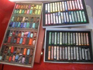
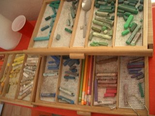
Most pastelists just love to look at all the colors, I think. You can never have too many pastels. I'm including a couple of photos of some of my pastels as a sample. :)
I am an artist that paints in pastels, with some oils, and acrylics. I sketch in pen and ink. As an artist my original paintings are influenced from living in Texas, New Mexico, Arizona, Colorado, Bolivia, Peru and Chile, and travels throughout much of Canada and all our fifty States. This is my spot for posting paintings and sketches, to muse mostly about art, life and a little about UT Baseball.
Website Jo Castillo Art
Subscribe to:
Post Comments (Atom)
About Me
- Jo Castillo
- Bastrop, Texas, United States
- I Grew up in a small town , Magdalena, New Mexico. I enjoy art and the pleasure other people get from my work. I always donate some of my sales and art to charities, especially for children. That started in Bolivia with Para los NiƱos. "I cannot pretend to feel impartial about colors. I rejoice with the brilliant ones and am genuinely sorry for the poor browns." -- Winston Churchill
Labels
#inktober
(49)
#inktober2019
(27)
#inktober2023
(20)
#inktober2024
(2)
#inktober21
(11)
abstract
(1)
Acrylic Paintings
(75)
Arizona
(3)
Art House Project
(14)
artist
(88)
artist blogger
(360)
artist bloggerinstruction
(3)
artist blogger instruction
(20)
artist blogger instruction
(17)
artist blogger instruction
(41)
artist friend
(7)
at
(1)
Balloons
(1)
Baseball
(210)
Bastrop Sketchers
(11)
Bastrop TX
(34)
Bolivia
(5)
Calendar
(1)
Canada
(3)
Challenge
(6)
Charity Events
(75)
chile
(4)
classes
(3)
coaster sketch
(9)
coffee
(1)
colored pencil
(59)
computer art
(5)
crayon sketches
(3)
DailyPaintworks Auction
(3)
demo video
(4)
Digital Painting
(14)
doodle
(1)
dphotos
(1)
exhibit
(156)
Figure
(4)
Fine Art Friends
(3)
Floweb browsing
(1)
Flowers
(33)
food
(10)
Footwork
(1)
fused glass
(3)
Gallery
(3)
gluten free
(5)
Golden Open paints
(2)
Golf
(12)
House Concert
(1)
iMac Sketch
(1)
Inktense
(2)
inktober2024
(2)
inst
(1)
instruction
(78)
iPad Sketch
(91)
iPad sketches
(112)
iph
(1)
iPhone painting
(3)
iPhone sketch
(27)
jo
(1)
Jo's Notion
(9)
Jo's Thoughts
(306)
Joanna
(2)
Joodles
(2)
Landscapes
(137)
Marines
(30)
marketing
(3)
meme
(6)
memorial
(1)
Music
(69)
New Mexico
(130)
Nonsense
(2)
Oil Painting
(72)
Oil Pastel
(1)
painting buddies
(1)
PanPastel works
(3)
Pastel
(29)
Pastel Demo
(60)
Pastel Paintings
(413)
pastel sketch
(142)
Pastels
(12)
pears
(3)
Peru
(1)
Photo
(83)
photography
(2)
Photos
(1001)
Plein air painting
(56)
podcast
(1)
poll
(1)
pottery
(2)
Powwow
(3)
Recipe
(6)
restaurants
(6)
scenery
(17)
Sculptor
(7)
sculpture
(4)
seascape
(2)
sketch
(4)
Sketches
(1863)
snow
(2)
Still Life
(36)
Stu
(1)
Studio
(26)
Texas
(70)
Trees
(36)
tribute
(5)
under painting
(1)
Unsorted
(7)
videos
(4)
watercolor
(180)
watercolors
(27)
web browsing
(262)
web page
(11)
wetcanvas
(1)
WIP work in progress
(15)
workshop
(8)
World Blog Hop
(2)
Yesterfest
(2)
zentangle
(3)
2 comments:
I know they're called primary colors 'cause all the other colors can be made by combining 'em in different ways. But, wow. Brown, tan, and beige just don't seem like something you should be able to get by mixing red, yellow, and blue! Cool.
'Tis fun! I am somewhat amazed that I can usually pull it off as well. :)
Thanks.
Post a Comment